Alexis Pedersen's Business Card
What makes a good business card? Over the past three weeks I have asked myself this question many times. Coloring, alignment and building creative interest were my focus this week. Here is how I achieved it.

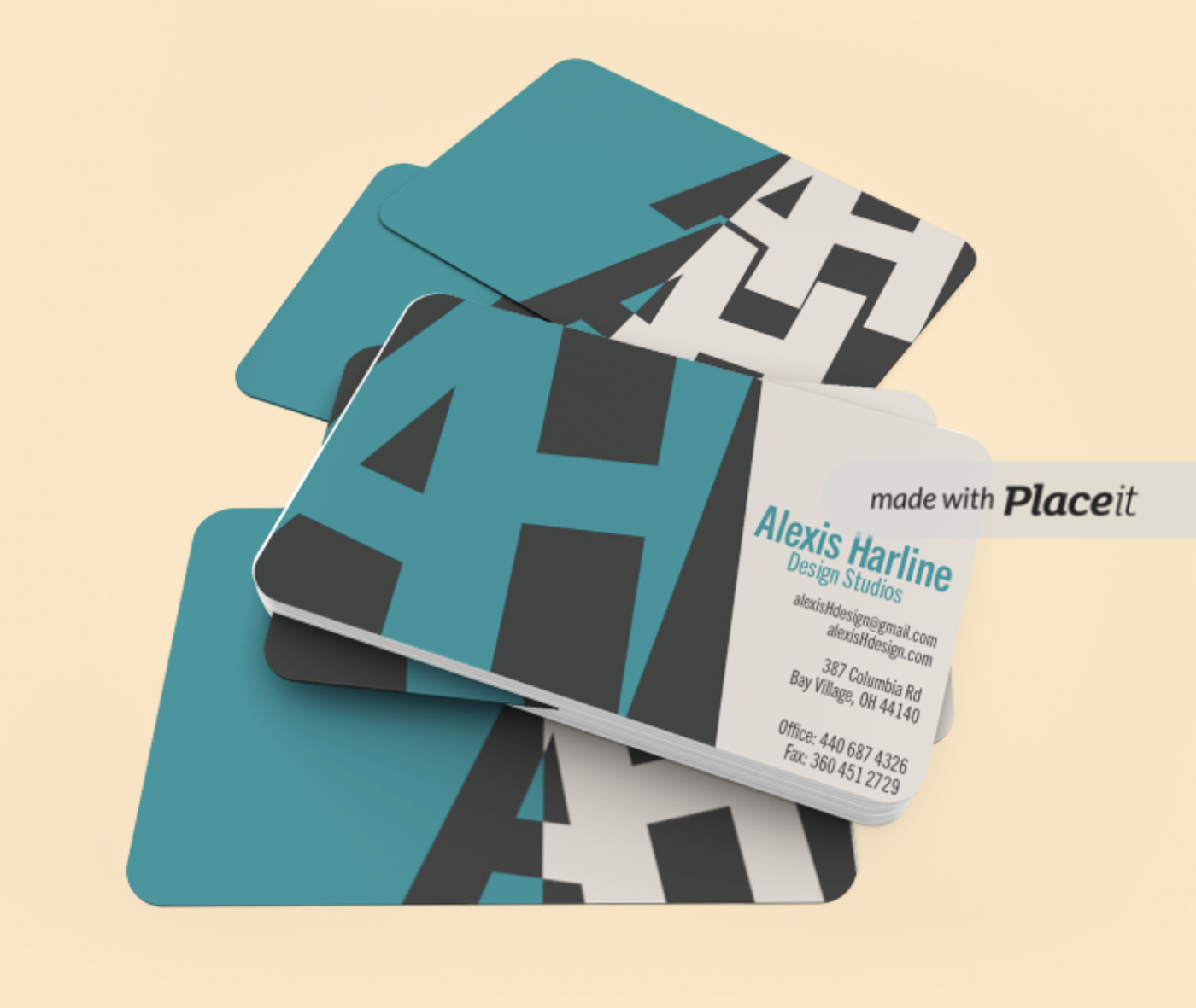
I first started with a simple "AH". However this was not visually interesting. I used the expand tool and the shape builder to add more visual interest to the H by making the part dark grey that overlaps the beige color block. this makes the overall front more interesting and more creative.

I loves the "AH" enough I knew that I wanted to use it again. I made sure that the AH on this side were at the same angle as the front side. This created unity between the two sides. I wanted the colors used for the back and the front to be the same, but differently used. I think this created visual complexity. I also made the AH off to the side to create negative space.
